INTENTIONAL AESTHETIC. VISUAL VIBES. BRAND ALCHEMY.
BRAND GUIDELINES by Haus of Hazel
MAIN HEADING:
Inter & Instrument serif
PARAGRAPH/BODY TEXT:
Inter
FONTS
Main Heading
Italic Option
Aa Bb Cc Dd Ee Ff Gg Hh Ii Jj Kk Ll Mm Nn Oo Pp Qq Rr Ss Tt Uu Vv Ww Xx Yy Zz
Aa Bb Cc Dd Ee Ff Gg Hh Ii Jj Kk Ll Mm Nn Oo Pp Qq Rr Ss Tt Uu Vv Ww Xx Yy Zz
Aa Bb Cc Dd Ee Ff Gg Hh Ii Jj Kk Ll Mm Nn Oo Pp Qq Rr Ss Tt Uu Vv Ww Xx Yy Zz
This typographic pairing expresses refined clarity and quiet authority. Lemon Creative’s font choices are designed to communicate trust, intelligence, and modern softness — a blend of strategic precision and Mediterranean warmth. Instrument Serif brings a subtle elegance to the brand. Approachable, composed, and just a little romantic. It mirrors Holly’s ability to hold depth and honesty while maintaining warmth and ease.
Contrasted with Inter, the system becomes grounded, structured, and effortlessly functional. Inter introduces clarity, rhythm, and digital fluency — ensuring seamless readability across websites, captions, proposals, and client resources (included in Canva, too, to apply to all social media posts if desired!). Its clean, creating nervous-system safety, reinforcing Holly’s promise of simplicity and control. Together, this typographic system communicates Lemon Creative as both polished and practical — a brand rooted in strategy, integrity, and ease, where beauty supports clarity rather than distracting from it.
BUTTONS
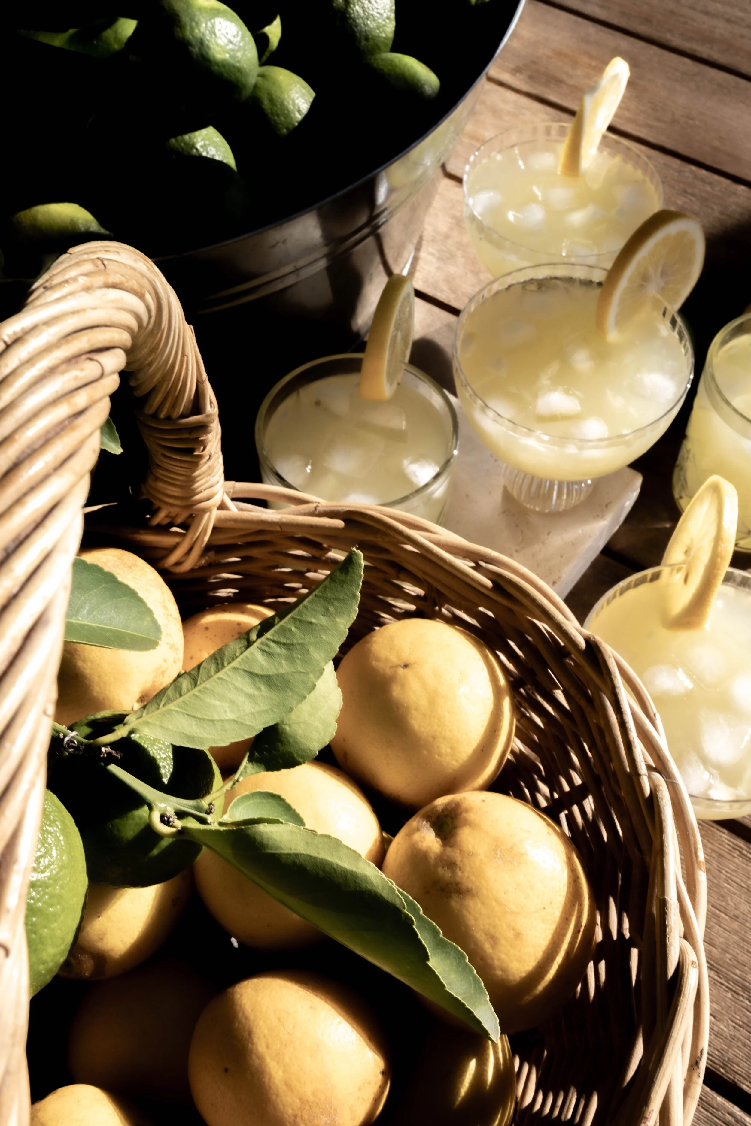
VISUAL MOOD & IMAGERY INSPIRATION
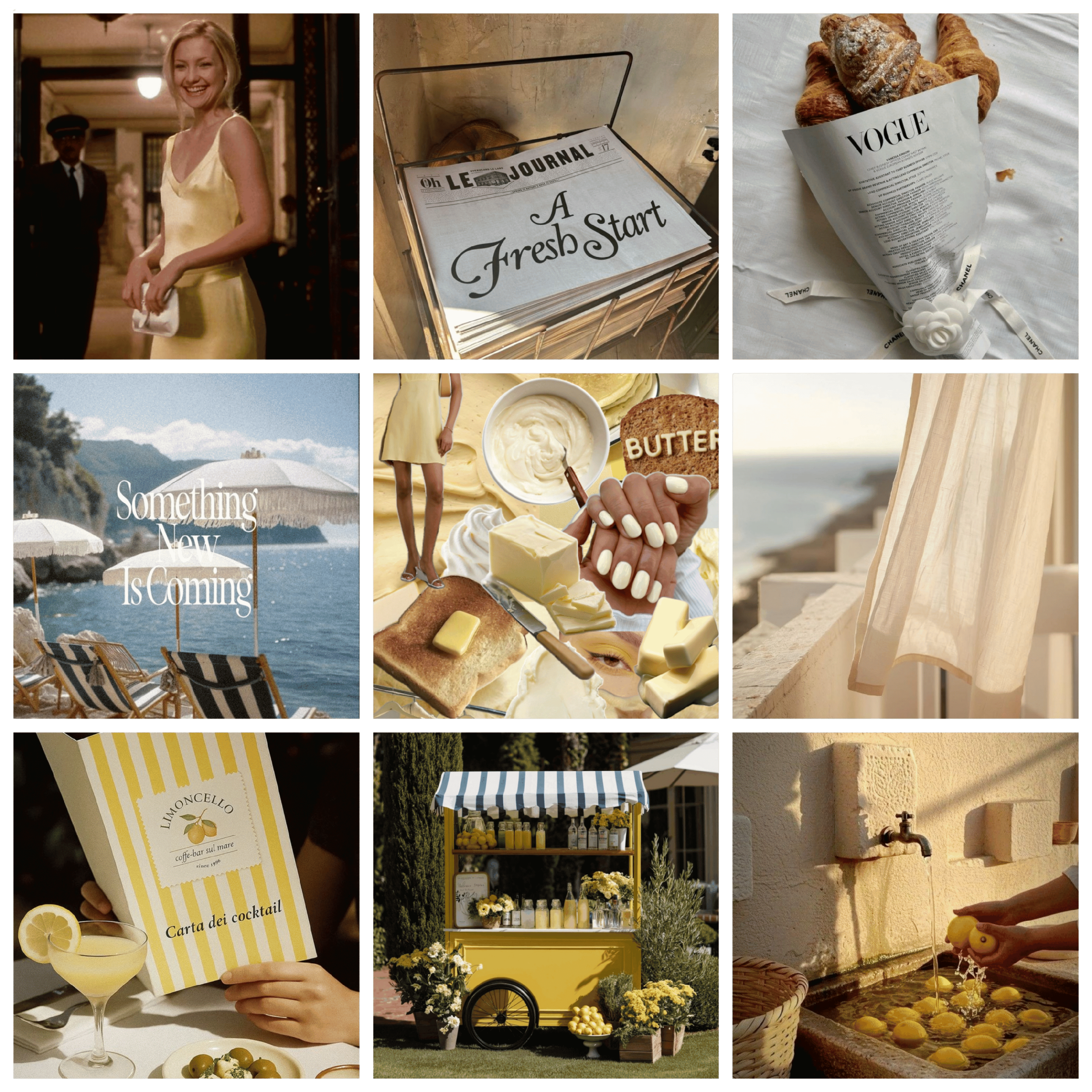
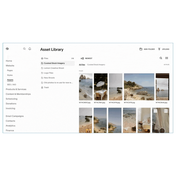
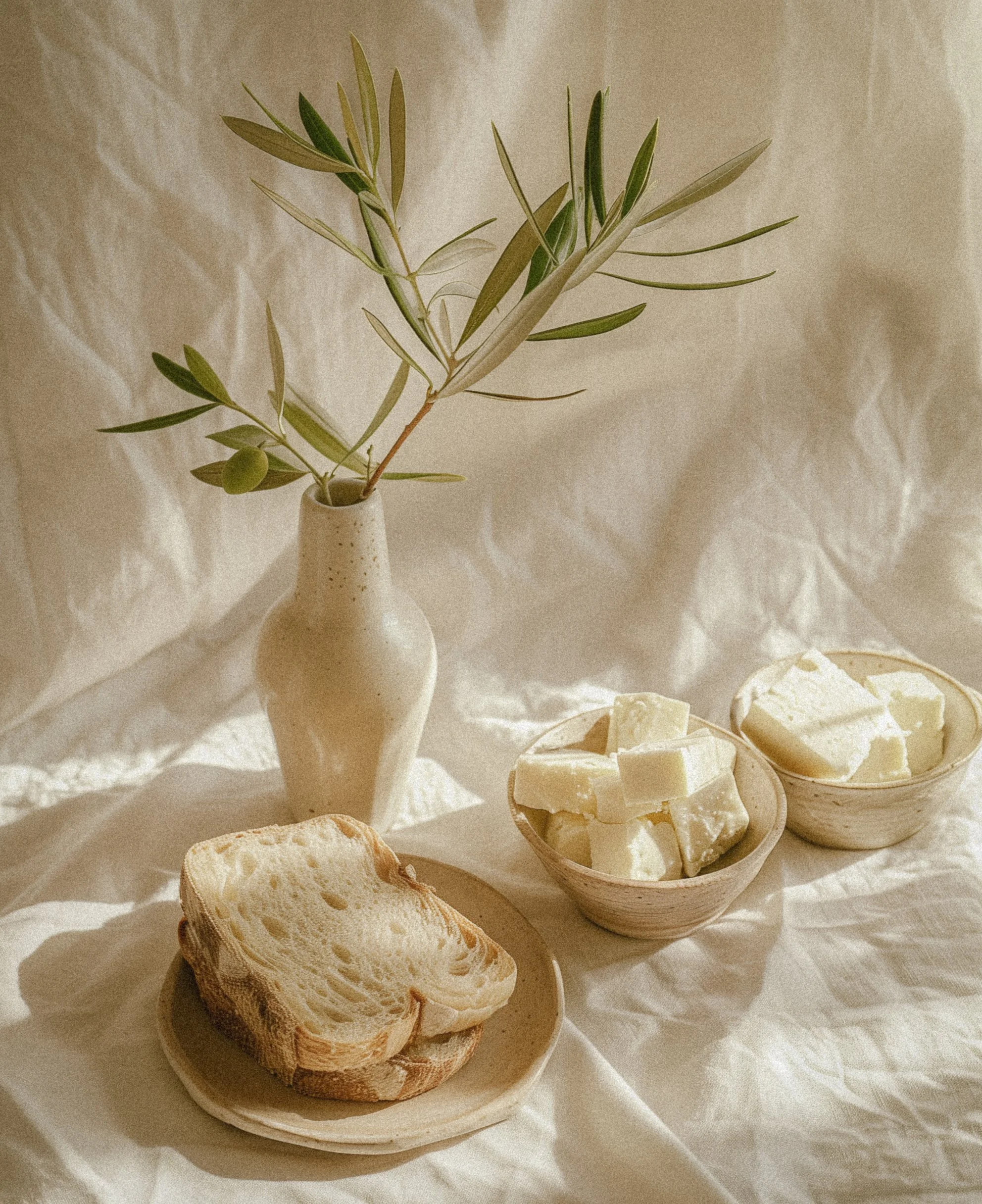
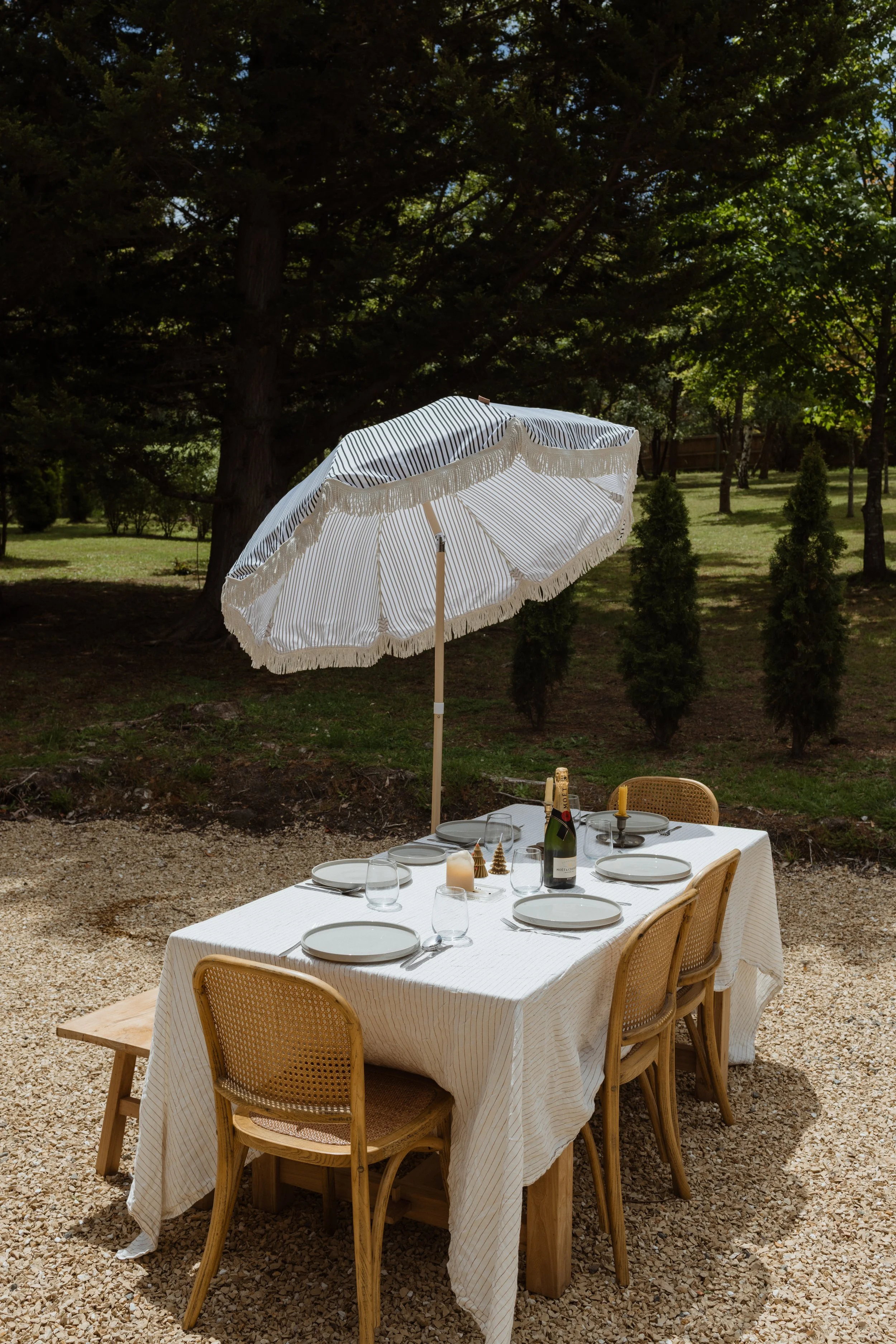
CURATED ON-BRAND STOCK IMAGERY
ASSET COLLECTION
60+ on-brand images intentionally selected already uploaded into website backend for marketing material use
Brand Goals
BRAND VALUES
Integrity • Honesty • Trust • Community • Clarity
BRAND PURPOSELemon Creative exists to help small and regional businesses show up online with clarity, confidence, and strategy that actually works. Rooted in lived resilience and real-world experience, Holly’s work translates the ever-changing world of social media into grounded, practical direction. Her purpose is to simplify the noise, rebuild trust in business owners who feel overwhelmed, and guide them toward sustainable growth through authentic connection — not trends, hacks, or burnout.
VISIONA future where small-town and regional businesses compete confidently in the digital space — not by shouting louder, but by communicating more clearly. Lemon Creative envisions a thriving local business community supported by strategic storytelling, strong relationships, and ethical marketing. Long term, the brand grows into a collaborative creative agency and studio — a sunlit hub where specialists work together to elevate local businesses while keeping strategy human, accessible, and grounded.
MISSIONTo make social media simple, strategic, and sustainable — equipping business owners with the clarity, structure, and confidence to grow their presence on Instagram and Facebook without burnout. Lemon Creative works alongside clients, not above them, delivering honest advice, practical systems, and results-driven direction that turns confusion into control.
TARGET AUDIENCEDriven small business owners in Townsville who are excellent at what they do but feel overwhelmed or second-guess themselves online. They value family, balance, and community. They don’t want to become influencers; they want their business to grow sustainably. Some don’t know how to use social media effectively. Others know the basics but lack confidence and strategic structure. They crave clarity, honest guidance, and a trusted expert who can cut through the noise and show them exactly what works — without fluff, ego, or pressure to be everywhere.
WEBSITE MAIN GOALTo establish trust and local authority while clearly communicating Holly’s expertise — guiding visitors toward joining the email list and booking a clarity call or consultation. The website should feel calm, capable, and reassuring — positioning Lemon Creative as the steady strategic partner businesses can rely on.
BRAND PROMISEEvery interaction with Lemon Creative leaves you clearer, calmer, and more confident about your online presence. You walk away with practical strategy, honest feedback, and a renewed sense of control — knowing your social media can feel aligned, manageable, and effective.
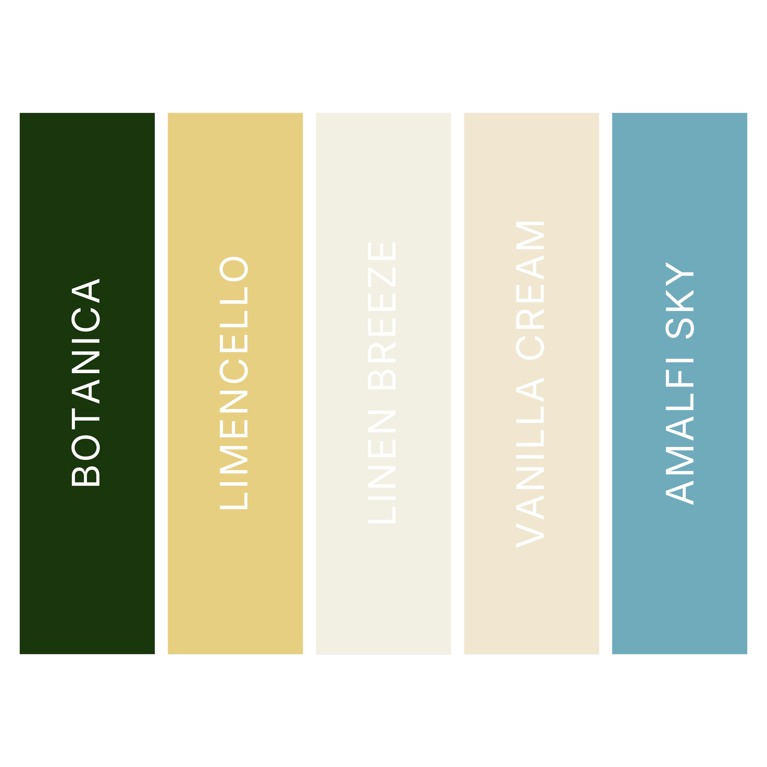
Colour Palette
Lemon Creative: making marketing easier and online efforts more profitable for local Townsville businesses
WITHOUT THE BURN OUT OR GUESS WORK
Colour Psychology & Associations
Sun-warmed but not sugary, reminiscent of postcards from that Euro summer without the overly vintage longing — the colour palette for Lemon Creative conveys the Goldilocks-amount of nostalgia, cheerfulness and reliability, signalling “your business is safe with me — and we’ll have a good time growing together.”
Together, this palette communicates grounded growth, warm intelligence, and calm authority. It blends optimism with structure, creativity with credibility, and lightness with long-term vision — a visual reflection of Lemon Creative’s promise to make social media feel clear, human, and sustainable.
Botanica — a deep tropical palm green — is traditionally associated with growth, prosperity, and enduring stability (wink to Venus in Capricorn). Its richness conveys maturity and long-term thinking, grounding the palette in trust and credibility. Psychologically, darker greens signal financial confidence and strategic strength — the feeling that something is rooted and built to last.
Limencello introduces buttery warmth, optimism, and creative spark. Unlike bright, high-energy yellow, this muted tone carries a softness that feels comforting rather than loud. Traditionally linked to positivity, clarity, and fresh ideas, yellow stimulates mental energy while maintaining approachability. Butter Yellow reflects Holly’s belief that social media doesn’t need to feel overwhelming — it can feel light, energising, and even enjoyable. It’s the warmth of morning sunlight in a coastal kitchen — gentle confidence rather than performative brightness.
Linen Breeze breathes neutrality, balance, and spacious sophistication.This minimal tone gives a visual exhale. For Lemon Creative, it mirrors Holly’s strategic restraint — no chaos, no clutter, just clear, considered direction.
Vanilla Cream softens the palette with comfort and nurturing warmth. Cream tones are traditionally linked to safety, ease, and approachability. They evoke a sense of hospitality and openness — like being welcomed into someone’s home. This shade reinforces the relational aspect of Lemon Creative’s work: social media is not a battlefield, it’s a conversation. Vanilla Cream creates the emotional safety clients need to trust the process and rebuild confidence in their voice.
Amalfi Blue introduces clarity, communication, and reliability. Blue is universally associated with trust, intelligence, and professional competence. This muted coastal variation feels fresh and breathable rather than corporate. Psychologically, blue stabilises and reassures — it lowers anxiety and fosters confidence. Amalfi Blue reflects Holly’s expertise within the Meta ecosystem and her role as a strategic guide. It signals, quietly but clearly: “I know what works — I got you.”
Brand Astrology
-
Rising Sign
Physical body
Appearance + style
Personality + character
Truth illumination
What people notice about you
The “face” you put on
Your motivation for living life
Outward emanation
Your rising sign broadcasts your medicine for you quite naturally. It is likely what people have reflected back to you as qualities they receive from being around you. This is the role you came to play.
LEO RISING:
Performer. Role model. Divine child of Universe. Individual. Personal. Warm. Bright. Radiant. Expressive. Bold. Main Character energy!
-
Alchemist. Shaman. Transformation. Alchemy. Sex. Intense. Magnetic. Dark. Underworld. Deep. Hypnotic.
-
Ambition. Legacy. Progress. Boss/CEO energy. Building. Purpose. Discipline. Resilience. Endurance. Empire. Success.
Mercury CODES
YOUR COMMUNICATION PLACEMENT
Ruler of communication
Articulation
How you share yourself
Speaking
Copywriting
Mindset + perception
Learning style
The Mercury placement gives us valuable information about how you are already wired to express and communicate, and the most align way to share your unique message. These are your gifts of communication and articulation, so that your dream clients can really receive you.
Leverage this code in your content creation for your aligned audience to resonate with you and disrupt any outdated paradigm marketing + sales tactics that don't feel good for you.
Venus AESTHETIC
YOUR MAGNETISM PLACEMENT
Where you’re charmed or lucky
Most ease in manifesting
How you connect with others
Attraction + desire
Beauty + aesthetic
Ease in sales
Receptivity
Your Venus reveals where and how you are most magnetic, and your most exalted state of attraction. This speaks to the environments and energies that align you to your receptive mode and what people love to pay you for.
Working with your Venus brand code increases magnetism, so it is what we focus on most for visual identity, aesthetic and "vibe" to exude.
Brand Tone & Voice
Calm yet authoritative (knowledgable, without being a know-it-all, y’know??)
Direct but supportive
Honest without being abrasive
Warm but not gushy
Confident without ego (shine bright in that Leo energy)
HOW TO USE THIS IN YOUR CONTENT —
Clear sentences, minimal fluff.
Practical language over buzzwords aka understood by boomers on FB.
Doesn’t over-explain.
Occasionally sharp when needed (leverage dat edge).
Community-oriented (“we”, “together”, “walk it with you”).
You’re not meant to be diluted!!! Use that Mercury-in-Scorpio boldness, intensity and directness